


Join Our VIP Email List
Keep up to date on deals, promos, and sales.
")
Oct 18th 2018
 Whether we want to come to terms with it or not, we've all made a design mistake or two. Sure, that mistake may not has been as drastic for some as others (ahem, using indoor paint while repainting the outside portion of our front door with a fun color - oops!), but if you've ever decorated any space of any kind, there's a high probability that a few design "no-no's" happened along the way. Today, we're diving into the top design mistakes you need to stop making!
1) Stop with All of the Matching
It’s easy to fall into the matching game when styling a new space, but be aware of the famous quote by the ever-wise Mark Twain, “Too much of anything is bad.” It’s true! Try not to go overboard when trying to coordinate colors in your space… while pops of similar tones is a nice way to tie it all together, too much matching can be a bit overwhelming for the eyes

Photo Credit: HomeDesign Mastery
2) Change Up Your Sizes & Shapes
Getting stuck in a rut of similar sizes and shapes is a slippery slope, but one that’s easy to get stuck on. When everything in a room is too big, too small, or the same shape, you’re going to turn your space into an eyesore for all! Use different levels and sizes of furniture, lamps, and decorative items to create dimension throughout your room… and always be sure to buy the right size of furniture. Nothing screams “newbie” decorator than a couch taking up the entire room or an armchair fit for Will Ferrel in “Elf”!  Photo Credit: Home DIT
3) Ditch the Terrible Lighting
Your home should scream “refuge” and its atmosphere should never mimic a dressing room or cafeteria with harsh, ugly lighting. Ditch fluorescents and single, overhead lights for lamps of varying heights and sizes. Have a window that allows for natural light? Let it shine (pun not intended!) and use that natural glow to illuminate your spaces beautifully.
4) Say No to Exaggerated Themes
Sure, it’s fun and cute to use a theme as the inspiration for your room, but try not to go overboard with the prints, accessories, and art work. Rather, use a few key pieces of art or pillows to announce the theme, but combine various colors of the same pallet, allowing your theme-related pieces to stand out with vibrance
5) Be Aware of the Photos You Use
We adore a gallery wall as much as the next home-decor fanatic, but it’s important to be aware of what types of photos you’re displaying. While it’s sweet to display family photos throughout your decor, be sure to add some dimension and spark with a few other photo types. Have a favorite vacation spot or city? Mix in a scenic few or a skyline. Love animals and artistic displays? Why not throw a cute giraffe portrait in there, too? Try to think outside the box when creating your photo displays and avoid the common mistake of too many family-only photos. 
Photo Credit: Ugly House Photos
6) Don’t Paint First
This may come as a shocker for most, but we’ve found that painting before we choose our rugs, curtains, and any fabrics use can sometimes create unnecessary headaches. While you may know what color you’re leaning toward in the beginning, go ahead and purchase your accessories and furniture first, then match your paint swatches appropriately.
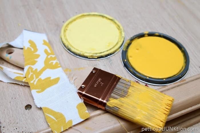
Photo Credit: PetticoatJUNKtion.com
7) Don’t Forget Your Focal Point(s)
Every room has a focal point whether you like it or not. Often, it’s the biggest piece of furniture, a permanent aspect of a room (i.e.: a fireplace), or a TV. Ensure your focal point is one that allows the eyes to rest easy and feel at peace. For rooms without large pieces of furniture (like a large bed in your bedroom), add a fun accent wall, gallery wall, or a piece of art that captures your attention from the get-go.

Photo Credit: The Casa Collective
8) Stop Using Things You Hate
Even though your Third-Cousin-On-Your-Father’s-Side gave you that vase, you shouldn’t keep it out of guilt. This isn’t about being ungrateful about special family heirlooms, you can still keep the item if it has a special meaning… but why not repurpose it? A coat of spray paint and new shade for that ugly lamp, fresh flowers filling that ceramic pitcher from your Great Aunt Helga, or a pretty wall displaying the china from your great grandfather’s sister. Still not a fan? Why not see if you can pass the piece onto a family member instead, or simply wrap it up and keep it put away in a safe place. There’s no need to feel the need to decorate with items that just aren’t your style.
9) Don’t Follow Trends
Buffalo plaid is in this season, but if it sparks memories of lumberjacks and sleeping in the outdoors and you’re more of a ballerina in a high end hotel, it's not going to fit well into your own likings and styles. More of a city slicker than a farmhouse chick? Ditch the farmhouse chic for your own favorite inspirations and don’t incorporate it into your own home! Sticking to more classic styles that show your personality is the best thing you could ever do in creating you own, unique home.
10) Rugs Too Small and Art Too High
Two design no-no’s would be the fairly consistent use of rugs that are too small for a space (making rooms like empty and lopsided) and art hung far too high. Generally speaking, your rug should be a life vest for all of your furniture… this means all the legs on furniture should be resting on your rug. Anything smaller and your furniture is dog-paddling for dear life! In regards to artwork and photos, make sure your center photo or picture is hung at least five feet from the floor! Anything much higher is going to create an unbalance across the entire space (not to mention, a crick in your neck!).

Photo Credit: Pinterest
11) Not Enough Pillows
You know we had to address this all too common, big, fat design mistake... not using enough pillows to cozy up a space and create character! Nothing is less inviting than a living room with too few pillows. It basically sends a message to guests (and your own brain) that it is NOT a space you want to relax. Be sure to use pillows of all sizes, shapes, and styles to create dimension and coziness throughout each space in your home.

Photo Credit: DIY Playbook
While there are still more fairly common design mistakes that you'll need to avoid when creating beautiful spaces, these top 11 are some of the most common! We'd love to hear your own design mistake tips and stories!
Keep up to date on deals, promos, and sales.